Assignment
We were given the task of generating and designing an idea for a product utilising an emerging technology. As a group we discussed and decided to focus on augmented reality and virtual reality; however, we decided to explore this further and chose to focus on mixed reality.
Where virtual reality creates a fully digital experience in which users are completely immersed into a virtual space interacting with virtual objects, and augmented reality combines the real world evironment with virtual objects, mixed reality builds upon this by allowing users to interact with those virtual objects.
The Idea
MusicianSpace is a mixed reality system that creates an immersive and engaging space for musicians to interact and play with each other. The main inspiration behind the system is to bring musicians together even if they are not physically together in the same space. Music can be a social activity and as humans we enjoy to interact with others, whether we are playing or observing.
Research
Competitive Analysis
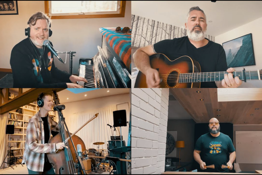
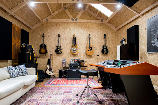
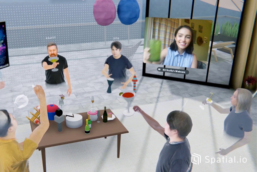
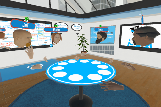
The idea of MusicianSpace led us to conduct competitive analysis in two areas, musical collaboration and mixed reality collaboration. Regarding musical collabration we discovered: Jam Kazam (an online video chat service designed for musicians) and general band practice spaces. Regarding mixed reality collaboration we found: spatial.io (an augmented reality meeting room) and meetingroom.io (a virtual reality meeting room). This analysis began to form the basis of our system.
Semi-Structured Interviews
To identify what users want from the system, semi-structured interviews were carried out with two musicians.
| Participant | Age | Experience (years) | Instrument(s) |
|---|---|---|---|
| P1 | 36 | 20 | Guitar, bass, vocals |
| P2 | 20 | 6 | Drums, bass |
Interview Questions
"How often do you play with other musicians?"
"Are these musicians usually friends or strangers?"
"Where do you go to play with them?"
"What kind of equipment do you use?"
"Have you ever considered playing with others online?"
"If the technology was available, would you consider it?"
"What would you expect the system to offer?"
Requirements
By analysing similar systems, and speaking to potential users, we decided on the system's inital requirements:
| Code | Requirement | Description |
|---|---|---|
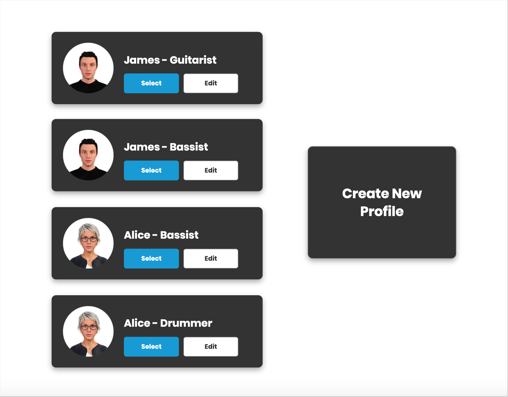
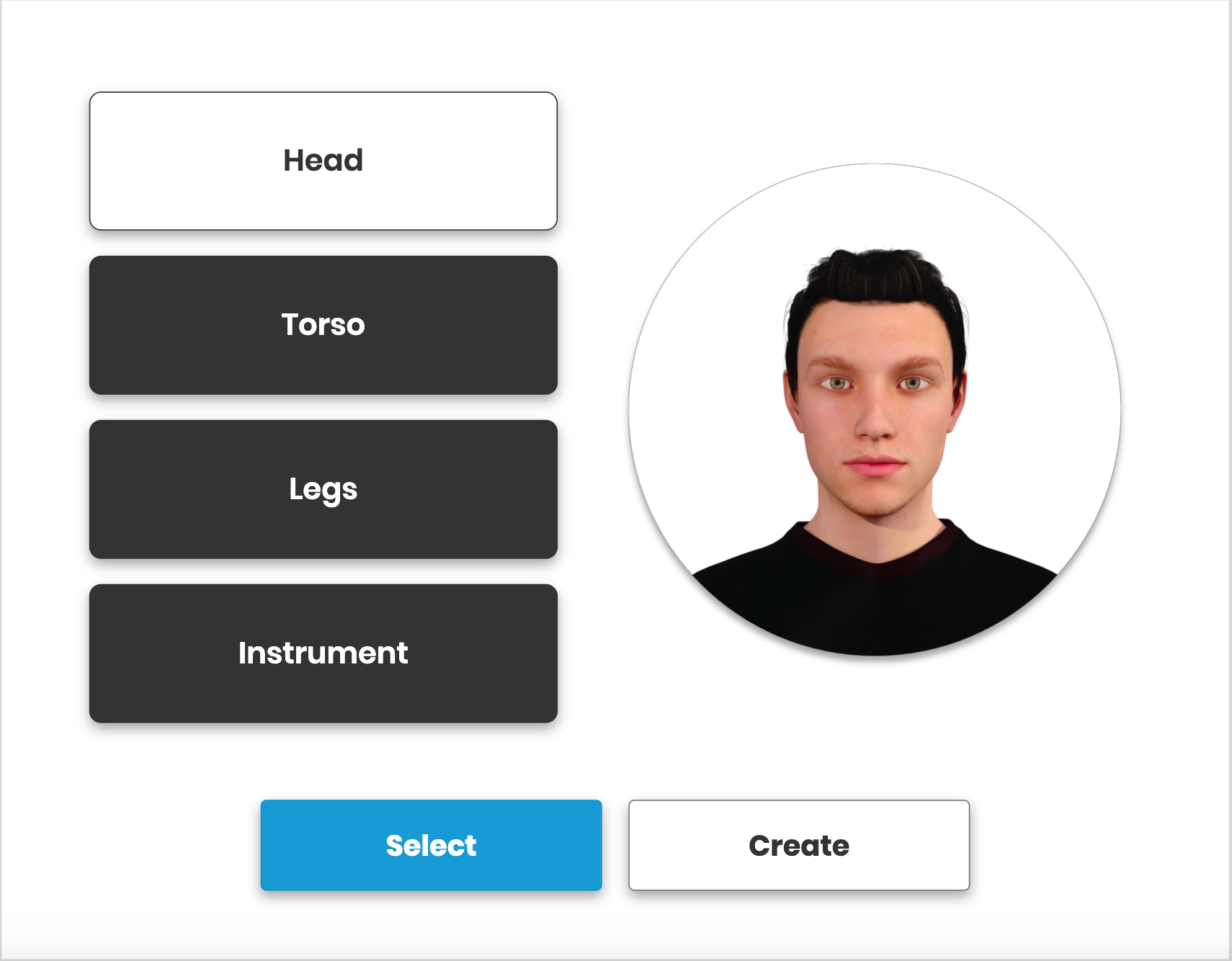
| FR1 | Avatar Creation | Users will create a visible persona that will be seen by other users |
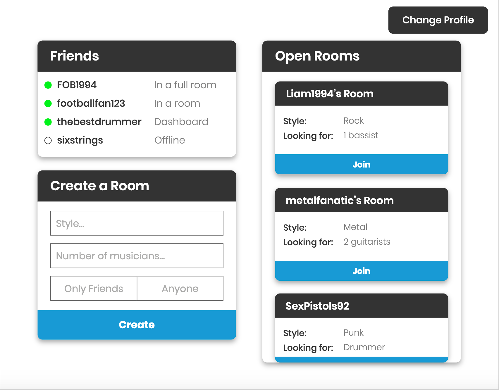
| FR2 | Friends | Users will be able to add other users as friends to see their current activity |
| FR3 | Rooms | Users will be able to create rooms that other users will be able to join |
| FR4 | Room Customisation | Users will be able to customise these rooms to show a preferred genre/number of musicians required and whether or not it will be open to everyone or just friends |
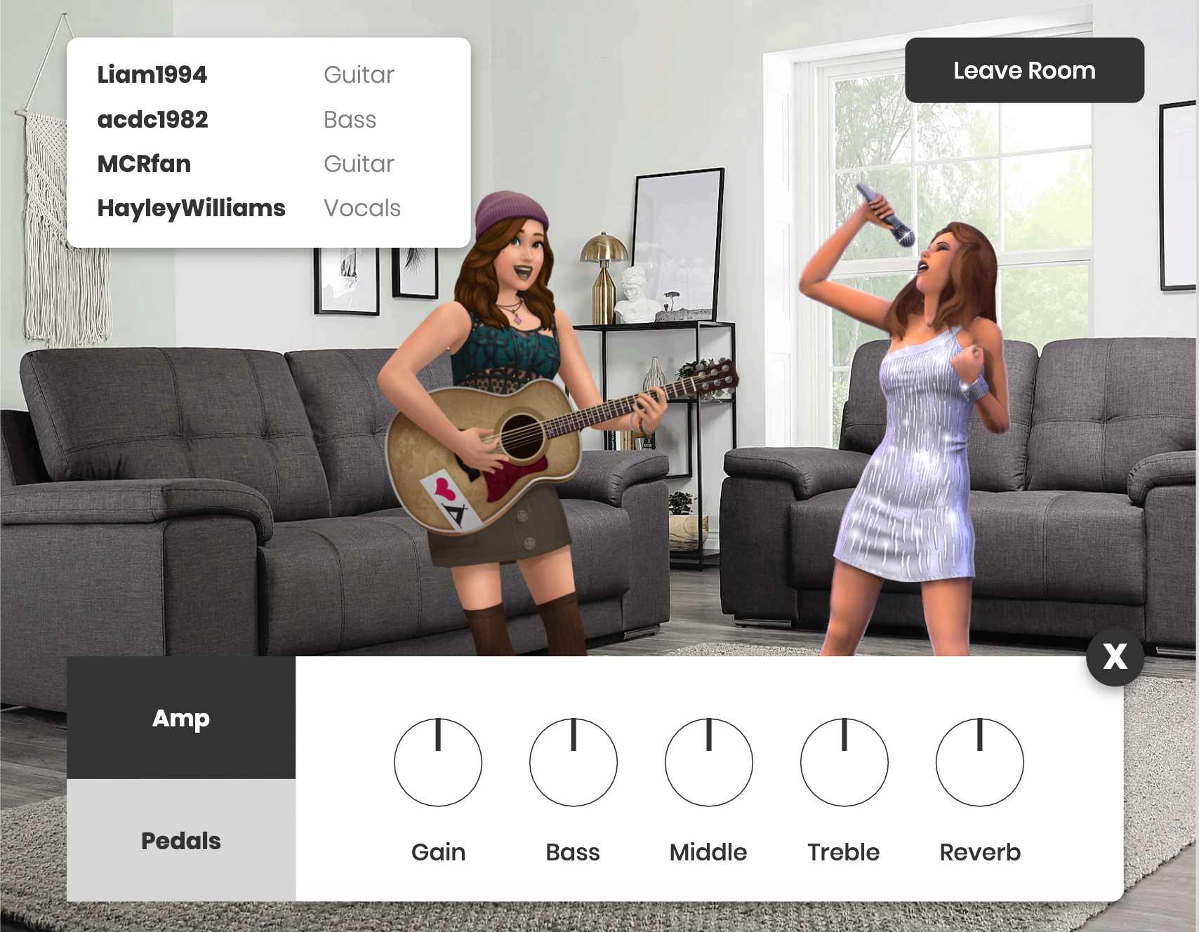
| FR5 | Audio | Users will be able to hear the audio that is produced by other users when in a room together |
| FR6 | Equipment | Tools will be displayed in respect to the instrument that is being used (guitarists/bassists will see amps and pedals, drummers will see effects) |
The Journey
Personas and Scenarios
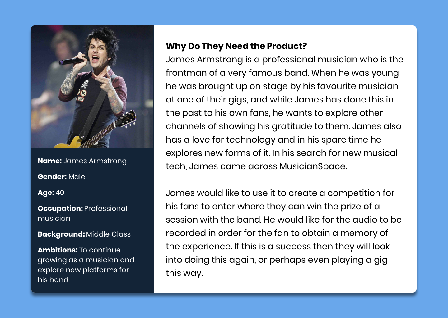
Based on the interviews and what each participant would want from the system, we identified two personas (with scenarios): a professional musician looking to play with fans; and a regular musician looking to play with friends.

Journey Line
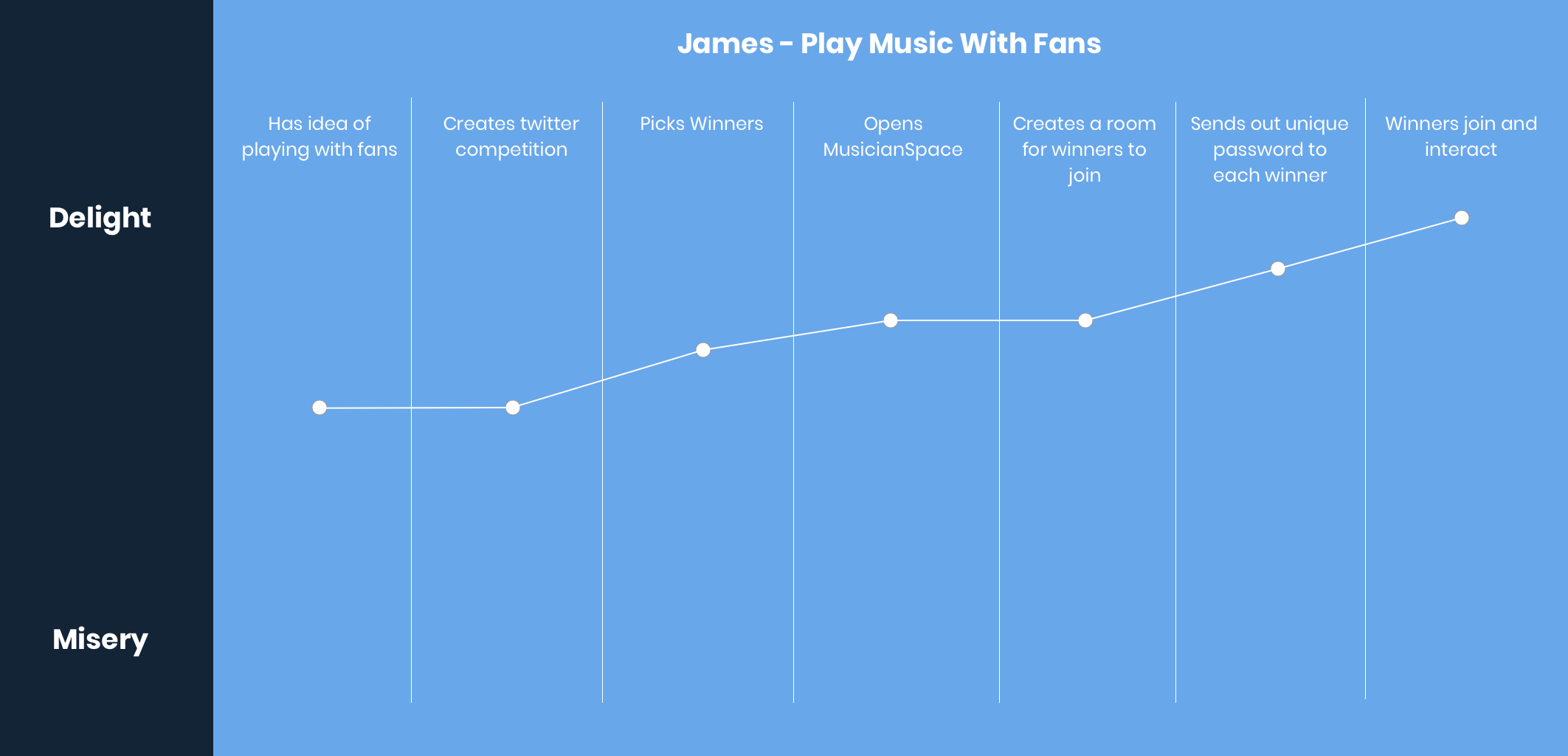
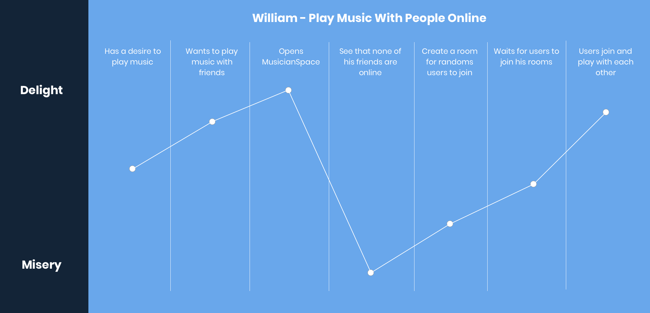
Journey lines were created to understand the emotions of potential users during their experience.
Implementation
Flow
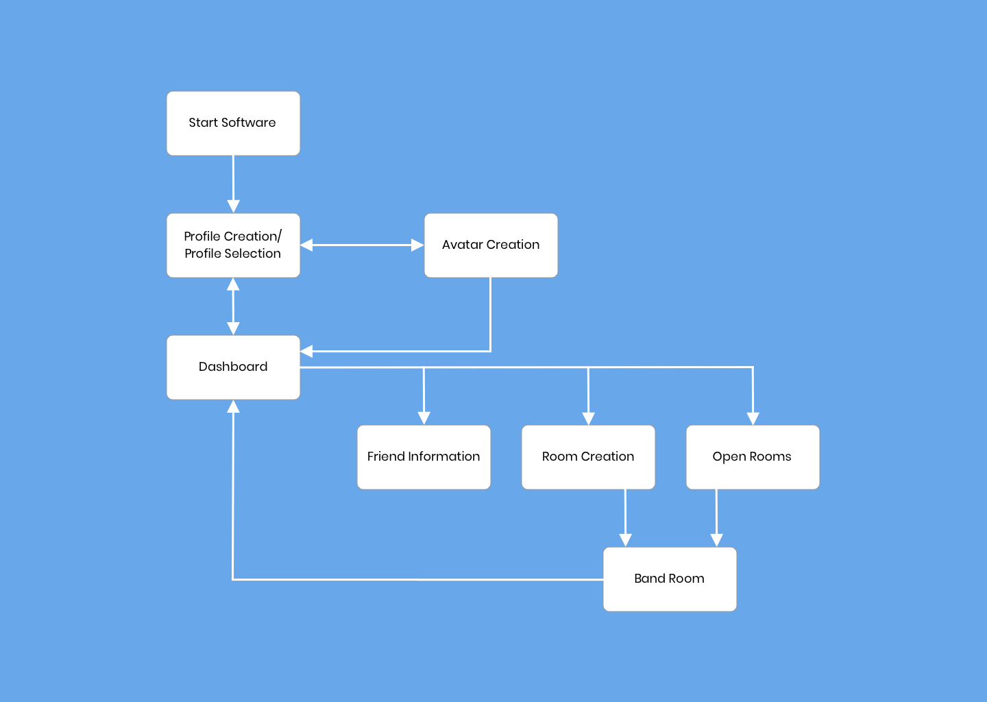
To understand how our system should work we created the siteflow.
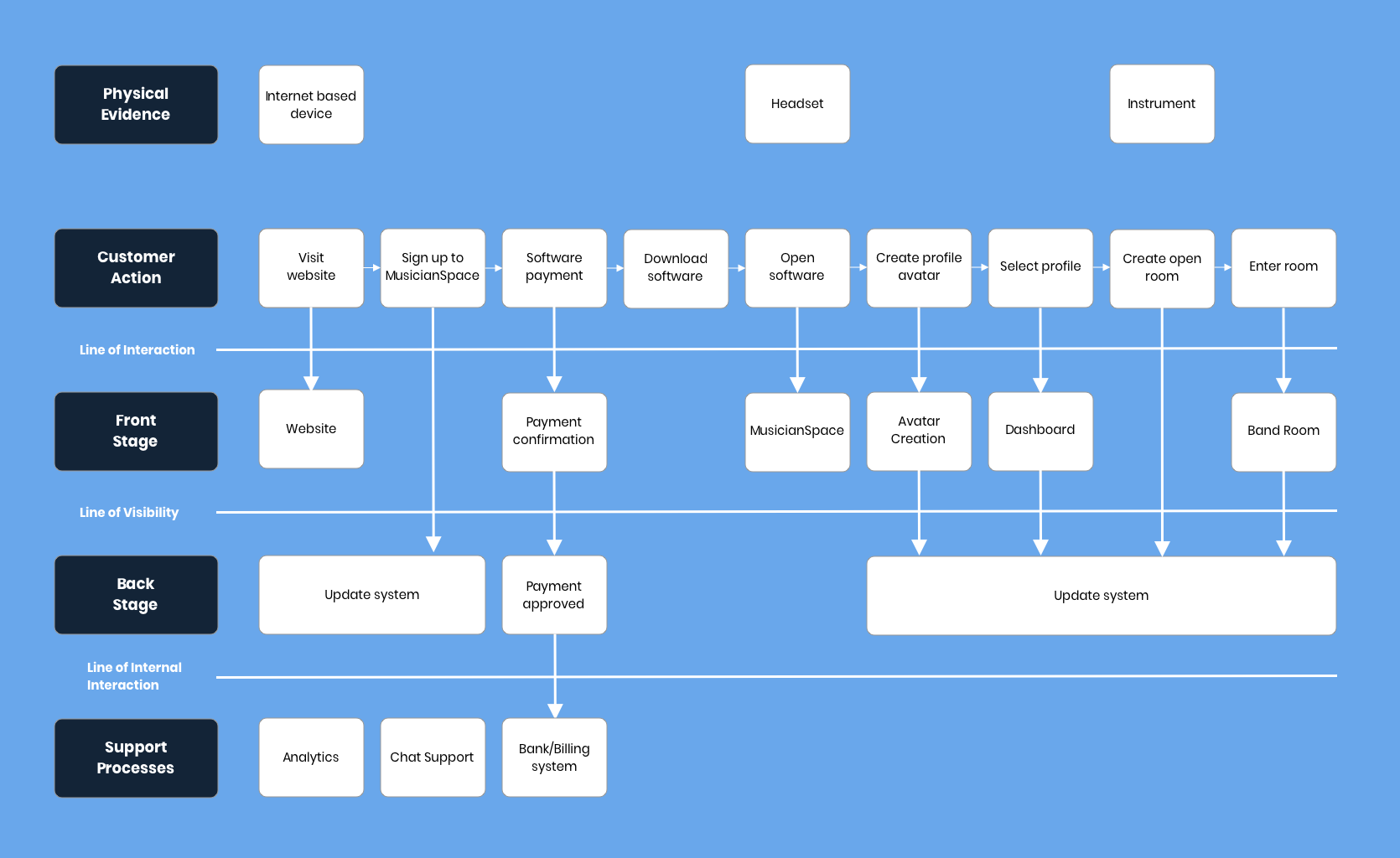
Service Blueprint
Sketches
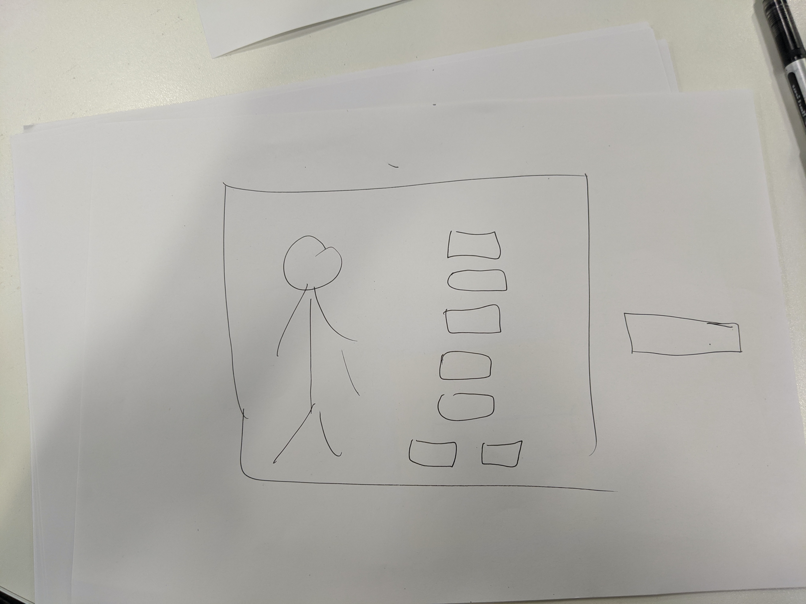
Once our architecture was finalised it was time to start designing our screens. This began with quick sketches using pen and paper. This method allows for rapid iterative design until desired layouts were achieved.



Lo Fidelity Prototype
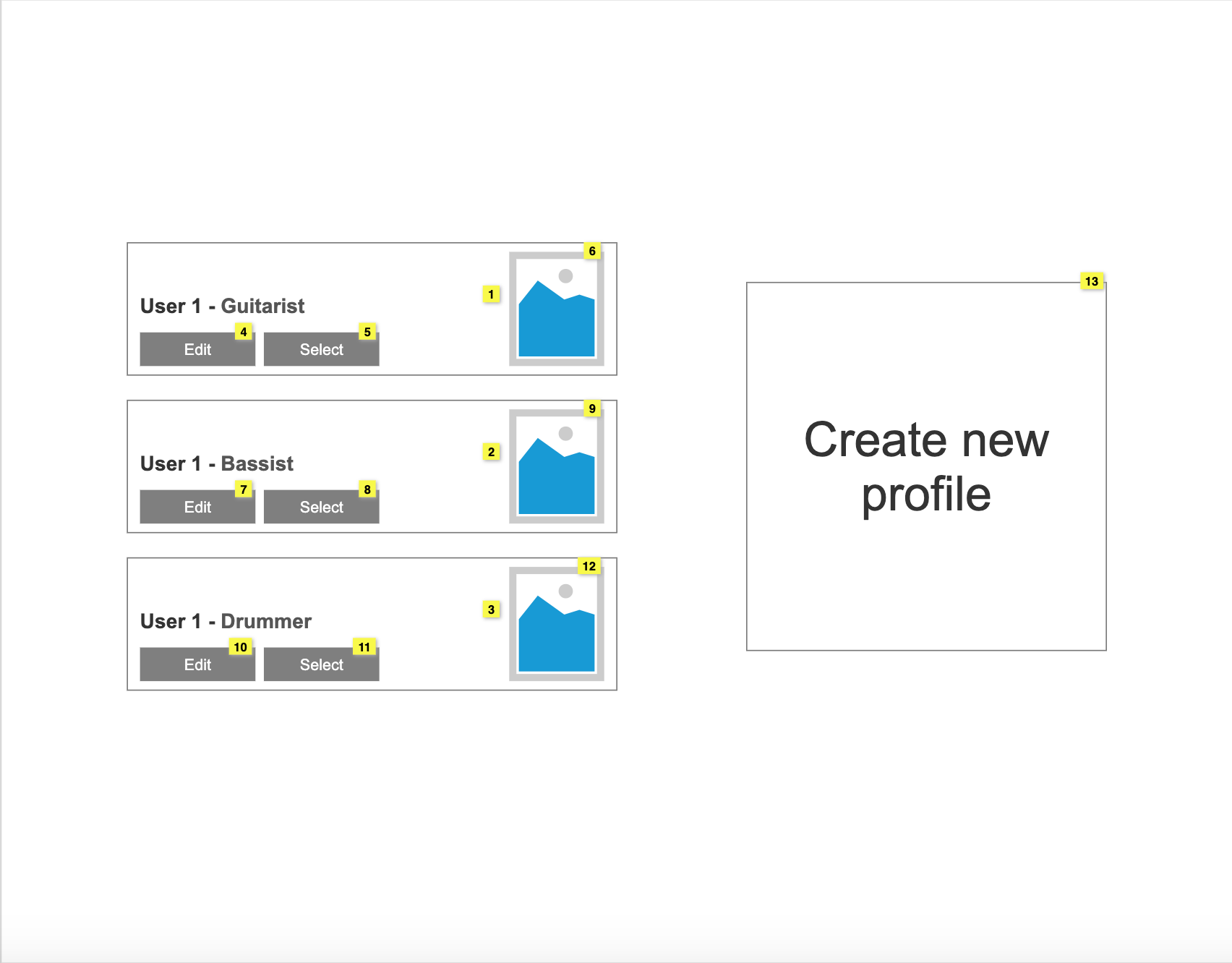
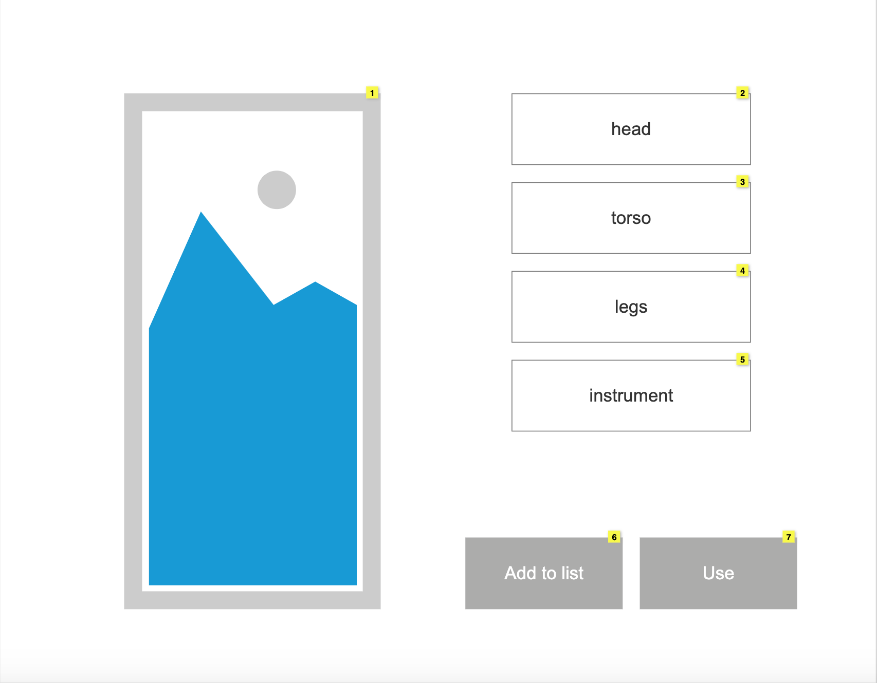
A lo-fidelity prototype was produced in Axure and can be accessed at the following address: Lo Fidelity Protoype. The wireframes are displayed below.


Hi-Fidelity Prototype
A hi-fidelity protoype was then produced in Axure and can be accessed at the following address: Hi Fidelity Protoype. The mockups are displayed below.
Testing and Evaluation
To ensure our proposed system would be usable for consumers we tested and evaluated the prototypes. We utilised the System Usability Scale (SUS), a ten question Likert Scale ranging from "strongly disagree" to "strongly agree", to test usability of the protoype.
- I think that I would like to use this system frequently
- I found the system unnecessarily complex
- I thought the system was easy to use
- I think that I would need the support of a technical person to be able to use this system
- I found the various functions in this system were well integrated
- I thought there was too much inconsistency in this system
- I would imagine that most people would learn to use this system very quickly
- I found the system very cumbersome to use
- I felt very confident using the system
- I needed to learn a lot of things before I could get going with this system
We gathered five users, a number recommended by the Nielsen Norman Group when it comes to usability testing, to assist in testing the prototype.
After carrying out tasks, users then completed the questionnaire and their feedback was converted into values ("strongly disagree" = 1 ... "strongly agree" = 5) To calculate the overall score, participant scores are then converted into a new number, added together and then multiplied by 2.5. This transforms the original score of 0 - 40 to 0 - 100. An average score is 68, a system achieving a score below this would be considered to have poor usability, and a system achieving a score above it would be considered to have good usability. Our prototype saw 100% of all users scoring above 68 (92.5, 72.5, 75, 85 and 77.5) suggesting that it is a usable system.
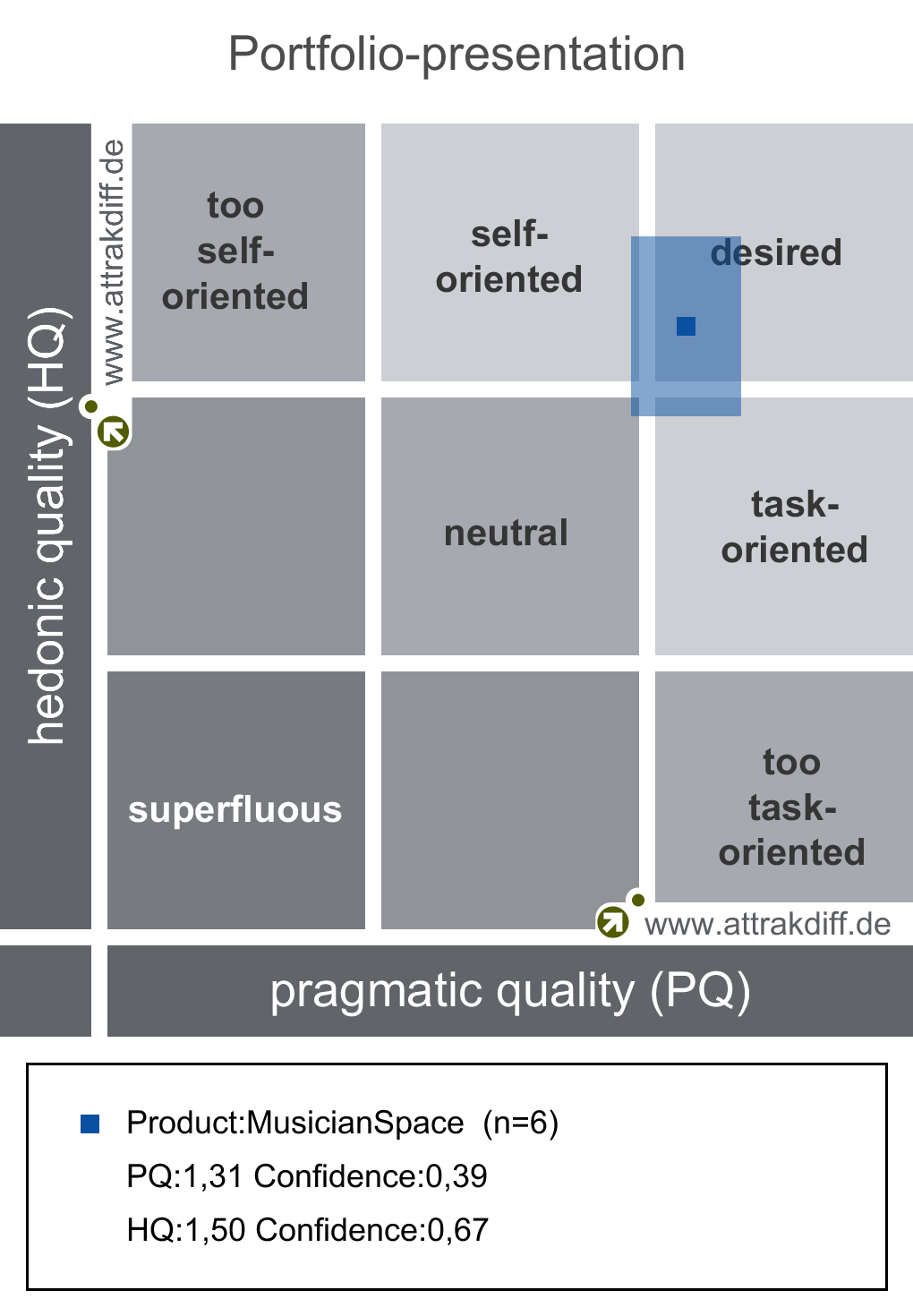
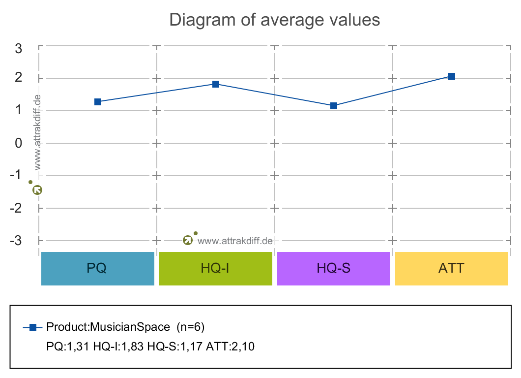
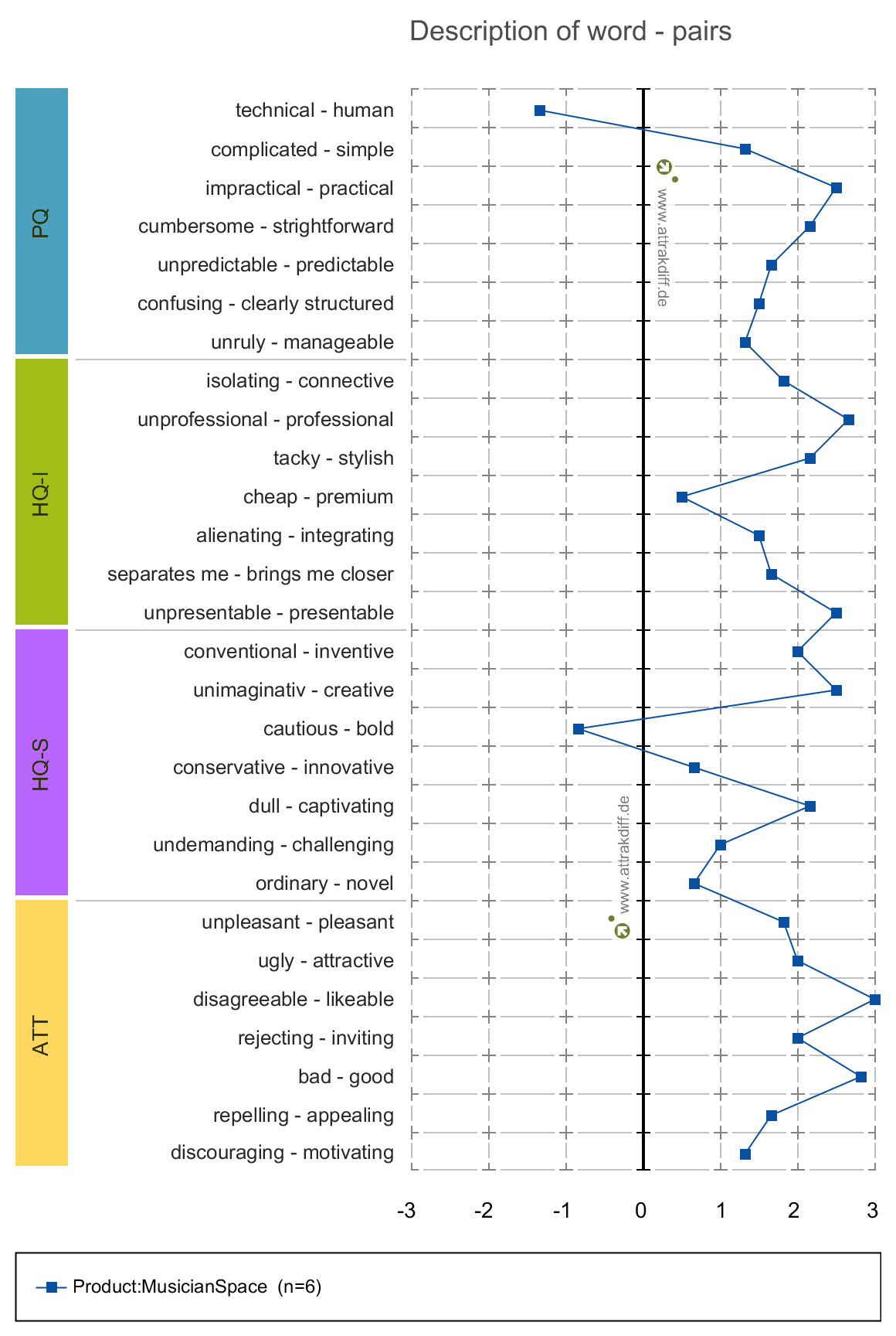
We also used AttrakDiff, a tool used to gauge the attractiveness of a product, in terms of usability and appearance. AttrakDiff generates three sets of results: portfolio or results, diagram of average valyes and description of word-pairs. These results are based on pragmatic quality, hedonic quality and attractiveness.
The portfolio of results shows that the confidence rectangle is mainly in the “desired” region but slightly extends out of it. A bigger confidence rectangle would mean one can be less sure of which area it belongs to, as ours is small and in one region it means our results are more reliable. Our system may be slightly more pragmatic than hedonic but it shows a good level of both.
The diagram of average values shows that each value for pragmatic quality, hedonic quality, and attractiveness sits at 1 or higher. This shows an above-average rating for each quality and tells us that the system can be considered practical, appealing and attractive.
The description of word-pairs shows the same values as the diagram of average values, but displays them as the individual values of each word-pairing our respondents rated the prototype against.
To evaluate the system further, we conducted a participant evaluation. Participants were gathered in an online session via Skype to provide thoughts and feedback from the tasks they had previously carried out. Due to the nature of the system and how it aims for users to collaborate, we decided to use a co-discovery evaluation. It results in a natural discussion with participants thinking out loud. The feedback from the participants then allows us to think about how we can enhance our system and how we could implement their ideas. The following statements and ideas were brought to attention from the evaluation:
- Users like the idea, both have tried to play at home online, but poor quality and latency issues get in the way of what should be a fun experience
- Users believed it is a very useful system especially with the current global situation
- Users enjoy the idea of being able to play with others without leaving the house
- One user stated that ever since moving cities, they haven’t played music with other people, all their musical friends are back in their hometown and she doesn’t get through often enough. It is also a pain to have to transport instruments back and forth just for a few hours of playing
- The navigation was easy to understand
- “Will I be able to click on a friend’s username and have options to invite them into a room, or join them if their room is open?”
- “Will rooms appear even if we don’t have the instrument registered to our profiles?”
- “Will I be able join with two instruments? (vocals and bass?)”
- Users enjoy the idea of being able to play with others without leaving the house
- “Will there be consideration for different skill levels? If I am not very good at keyboard, but still want to play with others will I be able to tell people I am a beginner?”
- “Will there be somewhere like a shop to download new guitar pedals and other accessories for other instruments?”
- “Will there be a forum or community aspect of the system?”
- “Would we be able to add a random person as a friend when playing with them?”
- “Would we be able to kick someone from a room or block them if they are just trying to cause trouble?”
We will then produce an improved prototype using the provided feedback, as well as using the suggestions to plan for the future of MusicianSpace.